How we start
We find the brand.
- Discovery on your story, market and positioning
- Moodboards that set the creative direction
- Concepts explored, refined and pressure-tested with you
What we deliver
You get the system.
- A full logo suite, drawn for every placement
- Color, typography and the rules that keep them consistent
- Guidelines any designer, printer or agency can follow
- Templates and assets ready for day-one rollout
What's included
01
Logo & Visual Identity
Primary mark, lockups, monogram and favicon.
02
Color & Typography
A palette and type system, and the rules that hold them.
03
Brand Guidelines
One document any designer or printer can follow.
04
Positioning & Rollout
The story, and the templates that put it to work.
Recent rebrand
Client workBefore Forme, and after.
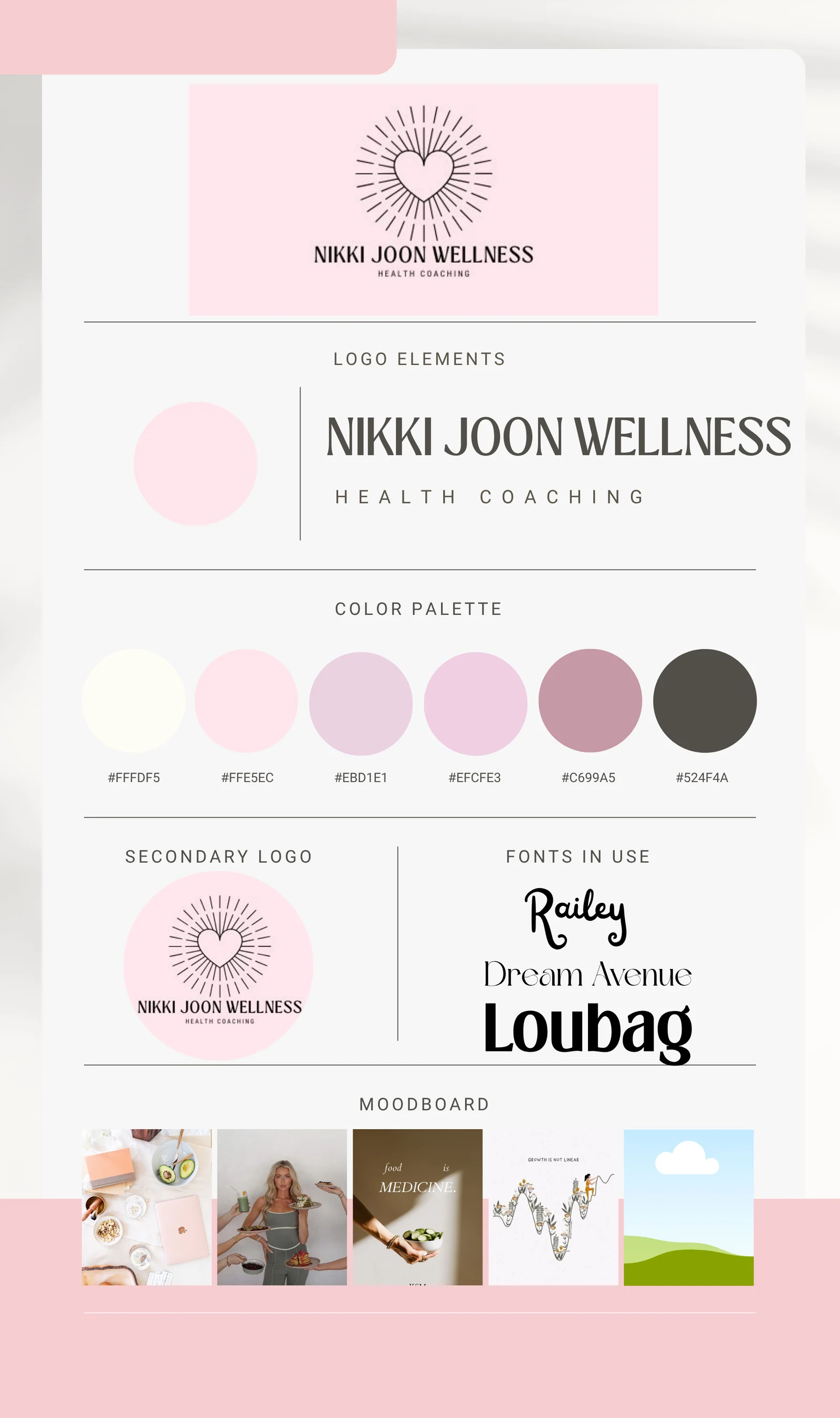
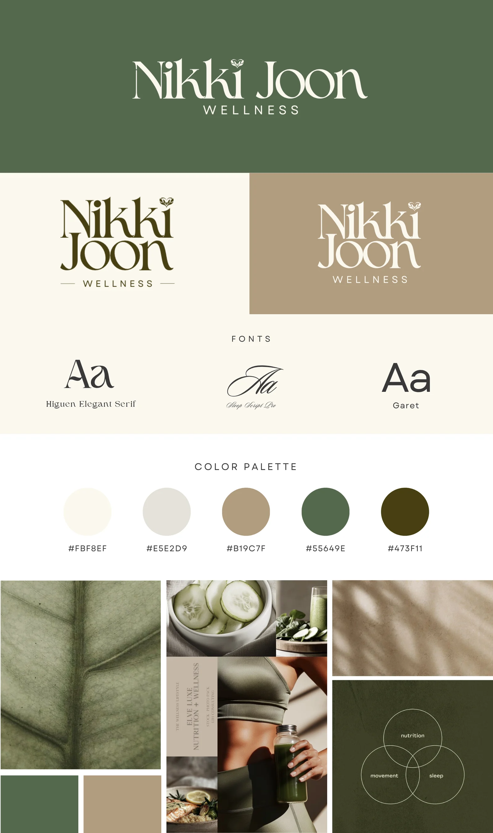
These are Nikki Joon Wellness’s real brand boards: the scattered kit she came with, and the complete identity system we built, logo, palette, type and voice on one page.
We design complete identity systems: logo suites, color palettes, typography, voice and guidelines, built to hold together everywhere your brand shows up.
The proof
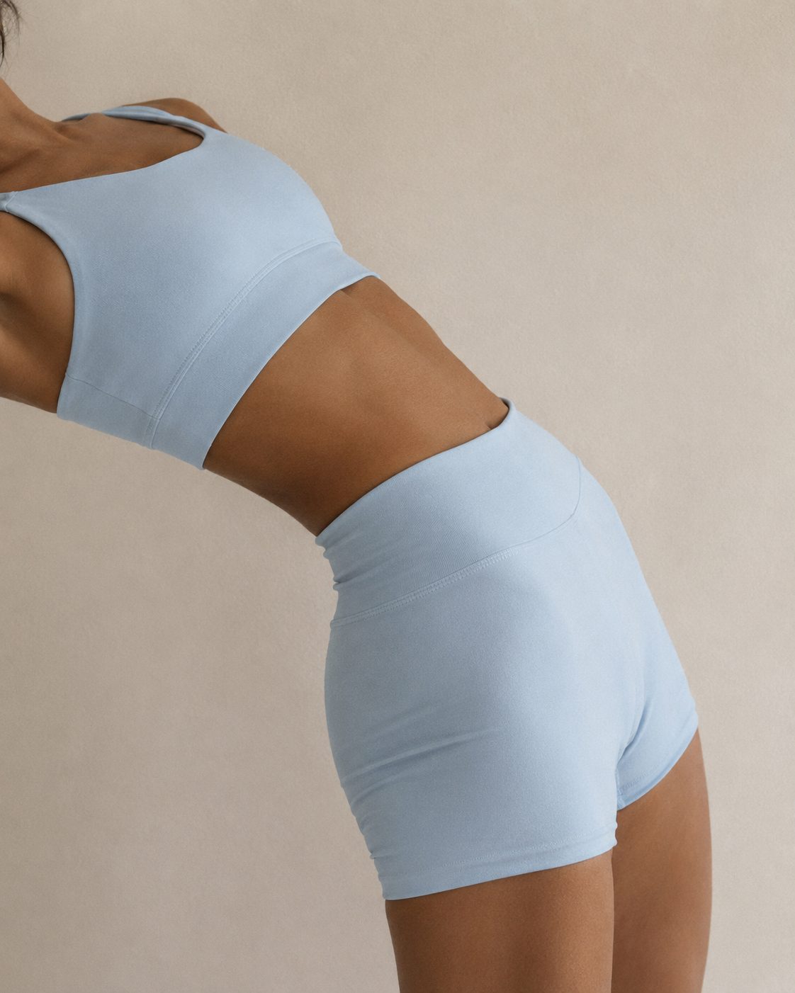
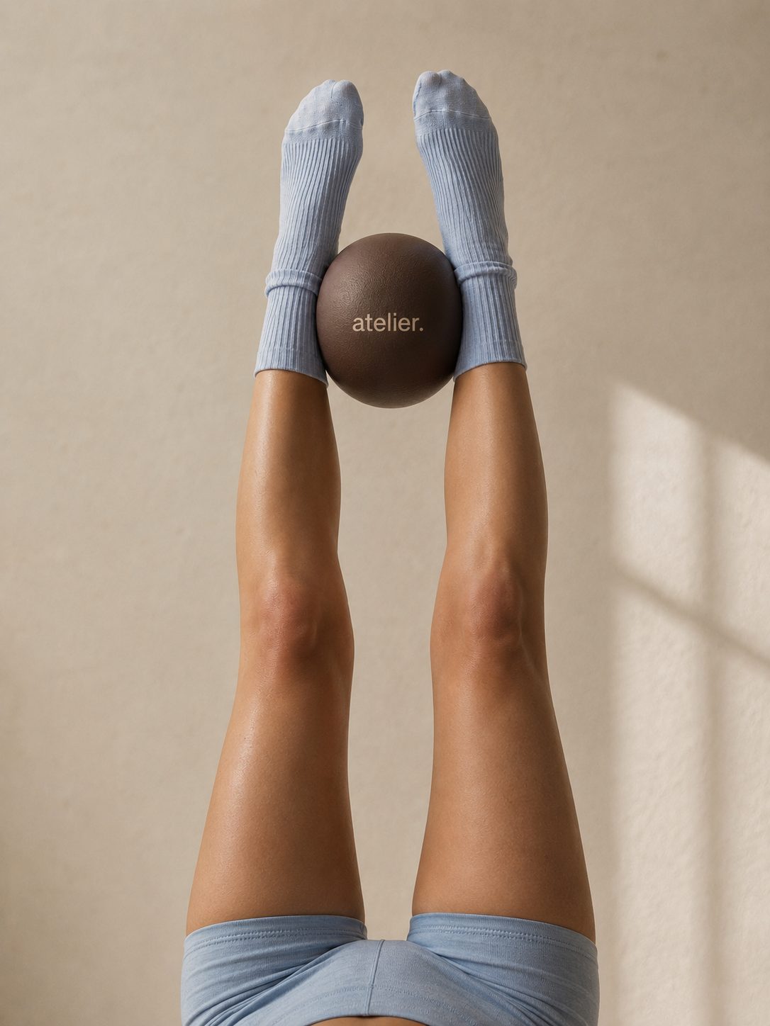
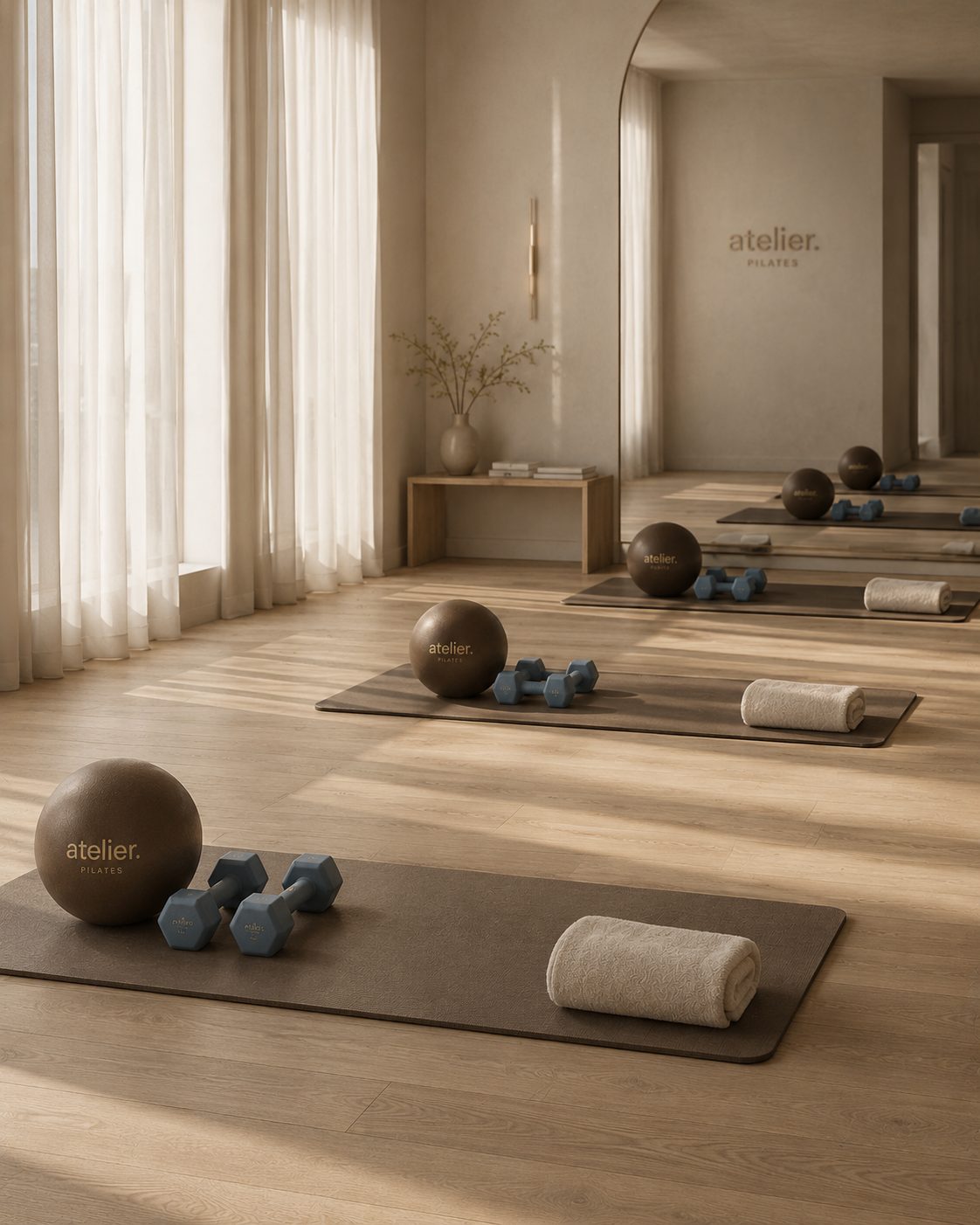
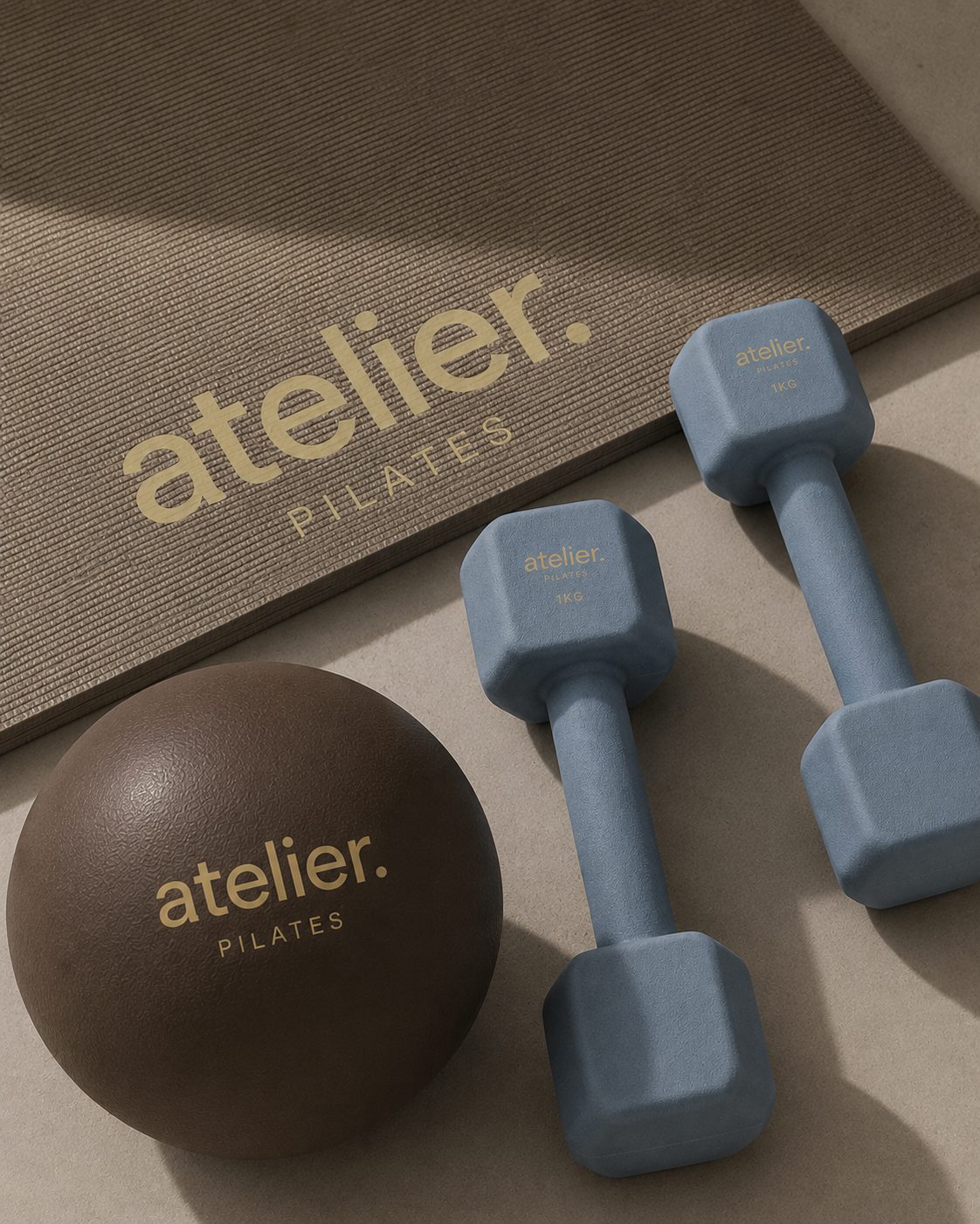
Built in houseOne brand, built end to end.
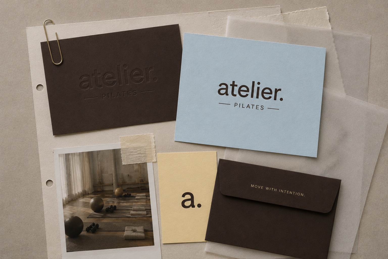
Atelier Pilates Brand Identity System
Brand Identity
atelier
Pilates
Volume I Movement as a practice. Precision as a ritual. Spring 2026
Paper
Pastel
Buttermilk
Burgundy
Ink
Art direction
The shoot